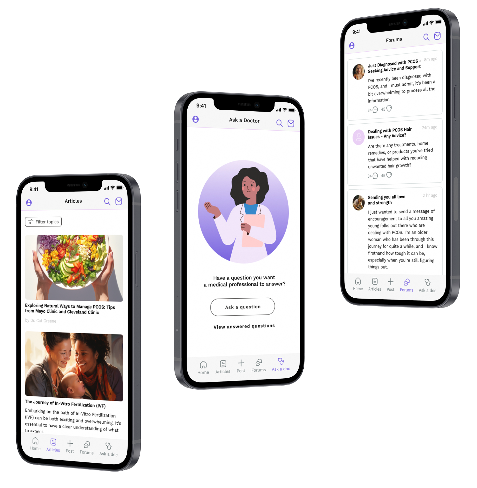
Remedy reproductive health support app
User experience case study
Student work
As part of my coursework for UW’s User Experience and Interaction design program, I explored the topic of empowerment in healthcare. Initial stages of information-gathering and user flows were done as part of a small group of students, while the final concept and design work were my own individual project work.
Deliverables
User interviews, concept testing, user personas and journey maps
Site map, user flows, low-fidelity to high-fidelity wireframes
Style guide, interactive prototype
We asked the question:
How might we help people feel empowered as they participate in their reproductive healthcare?
I began by interviewing a number of family and friends to understand their experiences and inform my next steps.
My initial user interviews focused broadly on understanding whether people, both patients and healthcare professionals, feel empowered as they interact with the healthcare system.
Whether my interviewees were receiving a diagnosis, finding accessible healthcare, or understanding what questions to ask, there was a common thread: reproductive healthcare can be particularly difficult to navigate.
My interviews revealed that many people have questions and difficult feelings around finding reproductive healthcare. It’s a fraught subject, with the potential to be emotionally charged and complex.
Additionally, reproductive health questions and concerns are frequently hard to share with friends. There’s a real need for support and connection in a private space.
The situation
Healthcare can be overwhelming. People need clear information and support in difficult moments.
The tension
People struggle with gathering the right information to inform how they manage their reproductive health. Sharing with loved ones is sometimes not possible or desirable.
The opportunity
Better outcomes start when people understand their own needs, can evaluate the information they find, and feel empowered to communicate about their reproductive health.
Competitive analysis revealed many apps and websites focused on fertility and period tracking, but which were mainly informational and one-directional, without community connections or conversation. Several products offered health support and community, but were either extremely broadly focused, or focused narrowly on issues such as Rheumatoid Arthritis and Migraine. There was a gap left in the reproductive healthcare support space.
To understand and empathize with the users, I developed two behavioral archetypes based on my interviews. These two archetypes embody the different approaches I saw in my user interviews, and identified different but similar needs.
From the information I had collected, I identified how each of the archetypes navigates their healthcare, and the painpoints associated with each step.
Feature priorities and information architecture
The highest priority identified in my user interviews was straightforward, clear information in the form of articles and informational posts by healthcare providers.
The second highest priority was the ability to interact with providers, as many of my conversations with interviewees revealed that some issues felt too small for a whole doctor’s appointment, but still needed a medically-based answer.
The third highest priority was interaction with other people experiencing the same health concerns. A sense of support and community during difficult or confusing health issues was highly important.
The lowest priority feature was the ability to share articles with friends and family- out of privacy concerns and wanting to maintain control over their health information.
This provided clarity on features that were most important to include, and further user interviews refined the feature list and prioritized the items that would be most important to the final users.
Sketching out a sitemap and user flow further clarified how features in the app would work for users. I wanted to strike a balance between straightforward information sharing and connection with other people.
The next step was developing low-fidelity prototypes, which I then tested on several groups of potential users. I was able to refine the layout and features based on the feedback from this session.
Some of the feedback included adding privacy settings, easy selection of topics for users to follow, and more flexibility in the “Ask a doctor” section to include images or not.
Styleguide and components
In addition to wireframes, I developed a styleguide including illustration, color palette, and text styles to utilize in the high-fidelity prototype.
It was important to find a final look that is approachable, energetic, and trustworthy- while still allowing user content and support to shine.
I then translated the styleguide into a figma library, including reusable components, that informed the final clickable prototype.
Prototype
The final prototype is intended to showcase the basic functionality of the app as well as the applied styleguide.
Later work on the project would include building out functionality around more user to user interaction, as well as expanding how users can interact with and find health care professionals.


